Colour
Our colour scheme is based on our brand guidelines with some additional colours to ensure interactions are clear and obvious.
Primary
Deep Purple
#311B77
rgb (49, 27, 119)
Purple
#8F1DBF
rgb (143, 29, 191)
Gradients
Primary Gradient
#311B77 0% - #8F1DBF 60% - #FF2DFF 100%
180°
Green Gradient
#57E8FF - #8DFFBE
180°
Secondary
Mid Purple
#5234B6
rgb (82, 52, 182)
Purple Tint
#F8F6FF
rgb (248, 246, 255)
Neutral
#ECF5F9
rgb (236, 245, 249)
Go Green
#8DFFBE
rgb (141, 255, 190)
Ice Blue
#57E8FF
rgb (87, 232, 255)
Monochrome
Black
#2F2F2F
rgb (47, 47, 47)
Dark Grey
#656565
rgb (101, 101, 101)
Mid Grey
#E8E8E8
rgb (232, 232, 232)
Light Grey
#F8F8F8
rgb (248, 248, 248)
White
#FFFFFF
rgb (255, 255, 255)
Alters and system messaging
Green
#1C9A5E
rgb (28, 154, 94)
Orange
#F56632
rgb (245, 102, 50)
Red
#E42929
rgb (228, 41, 41)
Green Tint
#F5FCF4
rgb (245, 252, 244)
Orange Tint
#FFF4EA
rgb (255, 244, 234)
Red Tint
#FFF3F2
rgb (255, 243, 242)
How to use colour
Ensure your designs have a minimum ratio of 70% white. It can be tempting to overdo callout cards, but bright cards should be kept to a minimum (5% or less of a page).
Gradients
Using the Primary Gradient
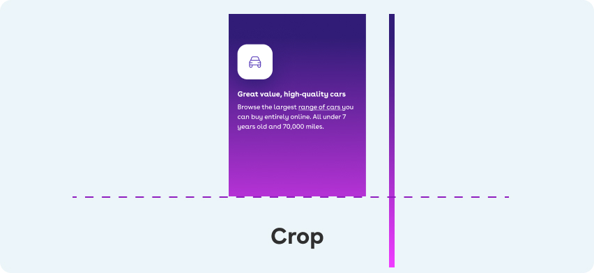
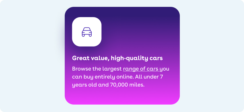
The Primary Gradient is reserved for large areas only e.g a hero banner or a full screen takeover. Crops into the gradient are allowed to ensure it's accessible. Starting point and angle must alway be the same however.

Do
- Ensure that text has high enough contrast to meet our accessibility guidelines.
- Apply to a large surface area.
Do
- Crop the gradient in smaller spaces to ensure the text has enough contrast.
- Crop the gradient from the bottom.
Don't
- Apply to small areas.
- Put white text over the bottom of the gradient.
Using the Green Gradient
The Green Gradient is reserved for the Cinch wheel only or icons on a Mid Purple background. It shouldn't be used as background colour.

Do
- Only use on graphic elements.

Do
- Use on icons when on a purple background.

Don't
- Apply to cards as text becomes harder to read.
Primary colours
Using Deep Purple
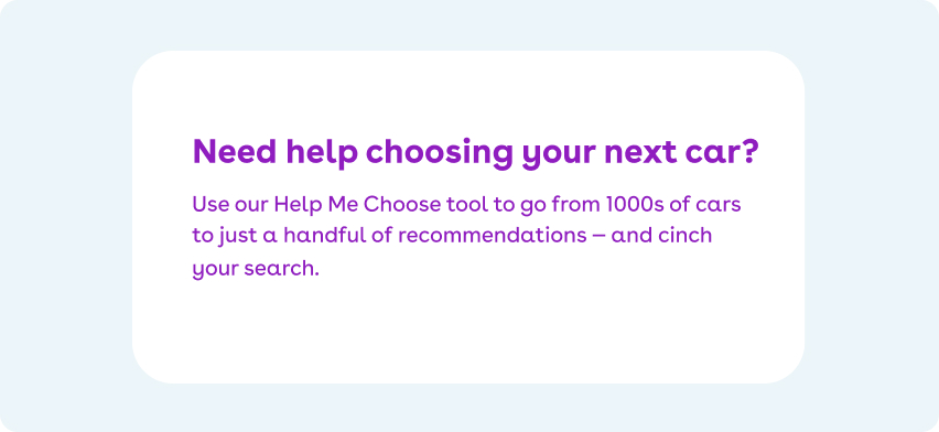
Deep Purple is used for our primary call to action. Designers must be considerate of how much Deep Purple is used on a page as it could be distracting.

Do
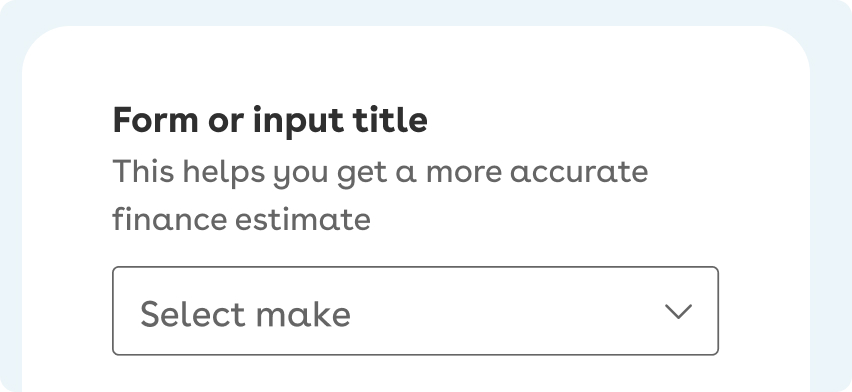
- Apply to the primary page title.
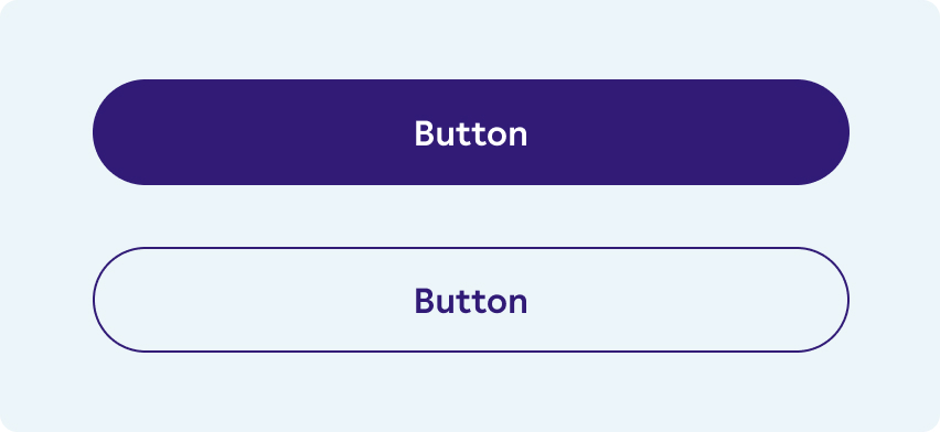
Do
- Use on primary button backgrounds.
- Use on secondary button borders and text colour.
Don't
- Use as a background colour if the section contains a secondary button.

Don't
- Use as a text colour on a complimentary background.

Don't
- Use Deep Purple for body copy unless on the Neutral colour.
Using Purple
Purple can be used for section headers or as a full background colour. Quote colours and visited link colours are Purple.

Do
- Use for headlines on white backgrounds.

Do
- Apply as a visited link colour.

Do
- Use as a background colour with white text.

Do
- Apply Purple as the quote text colour.
Don't
- Use Purple for body copy.
Secondary colours
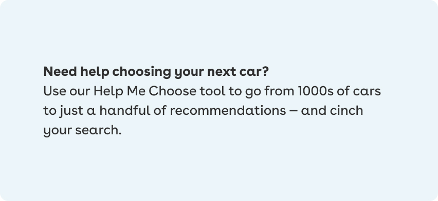
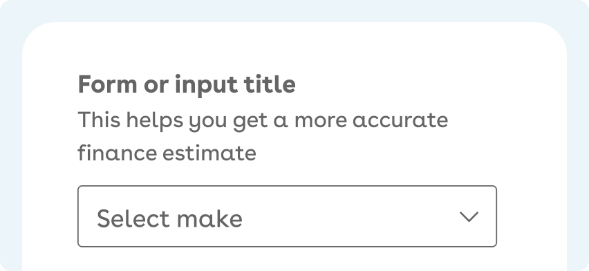
Using Neutral
Neutral can be used as a callout area, a full width background area for cards, or a background colour for bullet points. Don’t position cards with Light Grey and Neutral backgrounds in close proximity.
Do
- Use Neutral as a background color with a Black headline.
Do
- Use Neutral for large backgrounds.

Do
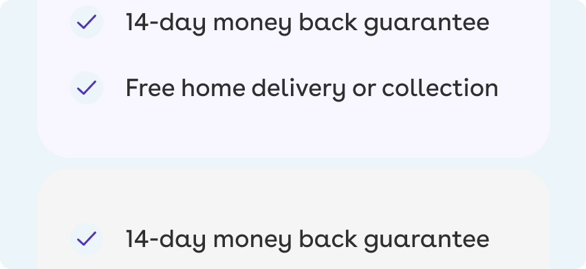
- Apply to the background of ticks.
Don't
- Use similar colours to Neutral together.
Using Ice Blue
Ice Blue can only be used as a high contrast accent colour on a dark background or as a high contrast background colour with Deep Purple. Use should be moderate.

Do
- Use Ice Blue as an accent colour on dark backgrounds within white text.

Do
- Use Ice Blue as an accent colour on dark backgrounds.

Do
- Use as a label background colour.

Don't
- Use as a background colour with lots of text as it is harder to read.
Using Go Green
Go Green can be used as an accent colour, again on a dark background but shouldn’t be used as a background colour in large areas. It can be used as a message or notification.

Do
- Use Go Green as an accent colour on dark backgrounds.

Do
- Use for text colour on dark backgrounds.

Do
- Use for label backgrounds with dark text colours.

Don't
- Apply to large elements as a background colour as it makes text harder to read.
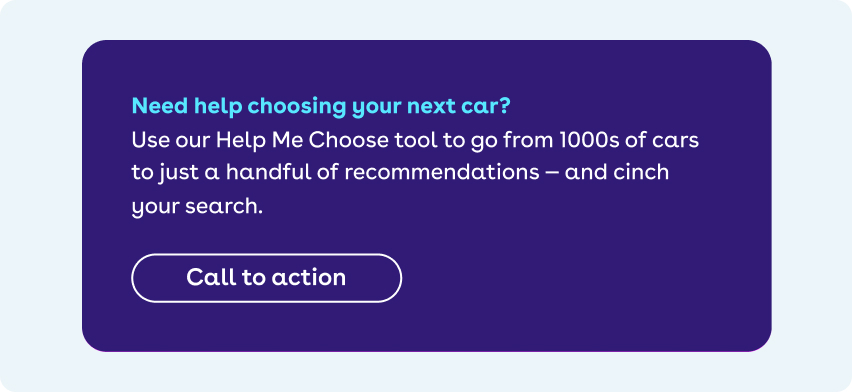
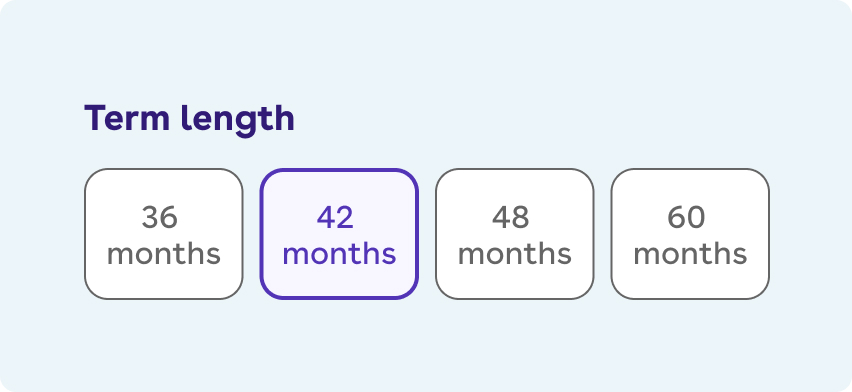
Using Mid Purple
Mid Purple exists to create links that contrast with dark or Deep Purple text. It also acts as the primary icon colour on a white background

Do
- Apply to standalone links with icons.

Do
- Use for inline links.
Do
- Apply to radio and interface sections as it gives contrast to Deep Purple.

Do
- Sparingly use as a background colour on sections.
Don't
- Use Mid Purple as a background colour on multiple sections.
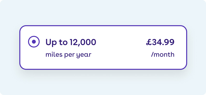
Using Purple Tint
Purple Tint is only to be used in selected states for UI elements to make a selection clearer. It is also used as a background colour for hints.
Do
- Apply to selected radio options.
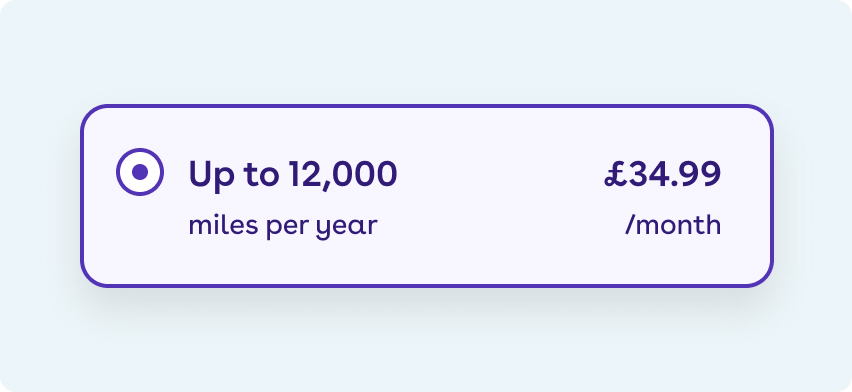
Do
- Apply to selected radio options.

Do
- Use for hint backgrounds.

Don't
- Use in background fills, use Neutral instead.
Monochrome
Using Black and White
By default all body copy on White backgrounds should be Black. White can be used on a strong contrasting colour.

Do
- Put Black text on a White background.

Do
- Use White text on a full coloured background.

Don't
- Use White text on Dark Grey.
Using Dark Grey
Dark Grey can be used to provide additional supporting or secondary information to primary Black copy.
Do
- Create information hierarchy by using Dark Grey for secondary information.
Do
- Create information hierarchy by using Dark Grey for secondary information.
Don't
- Use Dark Grey for titles.
Using Light and Mid Grey
Light Grey should only be used for cards, panels or tags to give a subtle contrast to content. Mid Grey should only be used for dividing lines to seperate content.

Do
- Use Black text on a Light Grey background.
Do
- Use Mid Grey dividing lines on a Light Grey background with Black text.

Do
- Use Black text on a Light Grey background for pills.

Don't
- Place in close proximity to Neutral or on top of the Neutral colour.
Alert and system messaging
Using Red, Orange, and Green
These colours only appear in errors, alerts, or confirmation messaging. They should not be used in any other context.
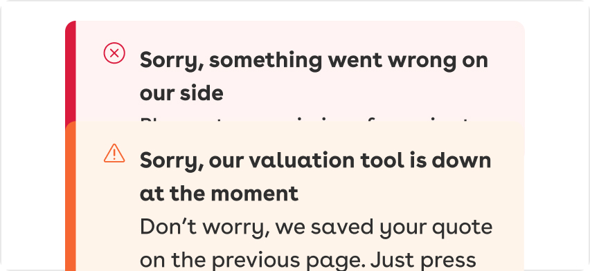
Do
- Use Red for an error message.
- Use Orange for an alert message.

Do
- Use Green for a confirmation message.
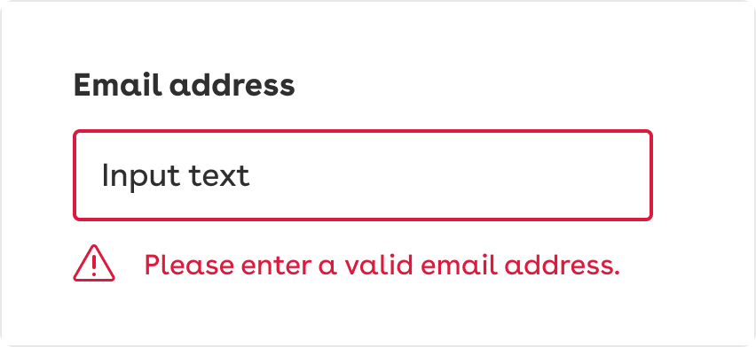
Do
- Use Red for error input labels, icons, and borders.
- Use Black text for error inputs.

Don't
- Use Red anywhere else other than for errors.