Iconography
Our iconography is designed to be friendly and clear to ensure it compliments our brand guidelines.
Quick links
Core icon set
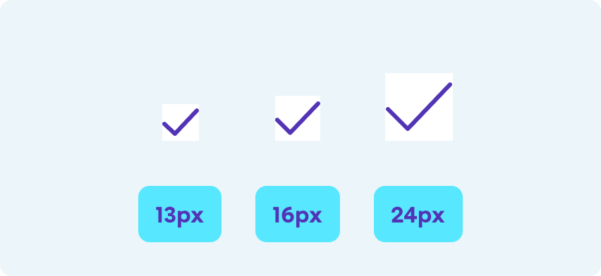
Standard size
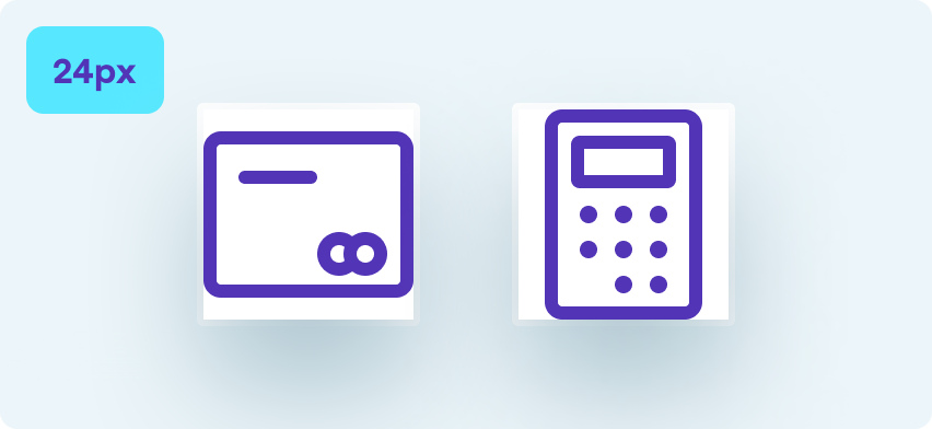
24px
Menu
Search
Settings
Share
Heart outline
Heart filled
User
Owner user
Edit
Question
Alert
Info
Tick
Checkbox circle
Cross
Close circle
Filter
Plus
Chevron down
Chevron left
Chevron right
Sort icon
Arrows
Go
Full screen
Rotate ccw
360
Gallery
Camera
Play
Basket
Home
Building
Our commitment
Covid
Covid circle
Covid shield
Oxford shield
Mask
CVC
Card
Wallet
Calc
Finance
Cash
Light bulb
Upload
Smart phone
Desktop
Copy
Speech
Chat
Phone
Call back
Open padlock
Closed padlock
Sale
Parent(s)
Time
Location
Star outline
Star fill
Sign
Referrals
External link
Link
Hand outline
cinchCharge
Small size
16px
Search
Favourites
Cross
Close circle
Alert
Info
Tick
Filter
Plus
Sort icon
Right Chevron
Down Chevron
Covid
Finance
Cash
Calc
Open padlock
Closed padlock
Sale
External link
Time
Loading spinner
Extra small size
13px
Plus icon
Close icon
Tick
Bin
Vehicle icon set
Standard size
24px
Body
Make model
Age
Door
Engine
Transmission
Paint
Fuel pump
Mileage
Seats
Price range
Cinch care
Performance
Emissions
Cinch Care warranty
Cinch Care breakdown
Acceleration
Range
Electric
Charge
Compare
Battery full
Battery 75%
CO2
MOT
Fuel
Part-ex
Home delivery
Drive type
Features
Engine power
Running cost
Learner
Reg plate
Small size
16px
Make model
Performance
Specs
Social icon set
Standard size
24px
Whats-app
Youtube
Car shapes
Custom size
64px x 32px
SUVs
Convertible
Coupe
Estate
Hatchback
MPV
Saloon
Large icons
Standard size
48px (can be scaled to 56px and 64px)
Home delivery
Collections
Target
How to create icons
All our icons are created with a consistent style. Follow the below guidelines to ensure your icons compliments the rest of the family

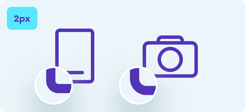
Stroke width
We use a consistent stroke width of 1.5px with a rounded edge
Size and padding
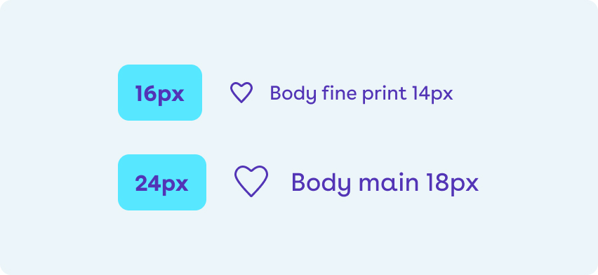
Try to ensure two edges align to the edge of the icon boundary or are sensibly balanced within the frame
Corner radius
Elements have a corner radius of 2 or 4px depending on the scale. Larger elements will benefit from a lager radius

Colour
We generally use Mid Purple for icons. Avoid applying gradients to icons unless they are large in size (above 48px)
How to use icons
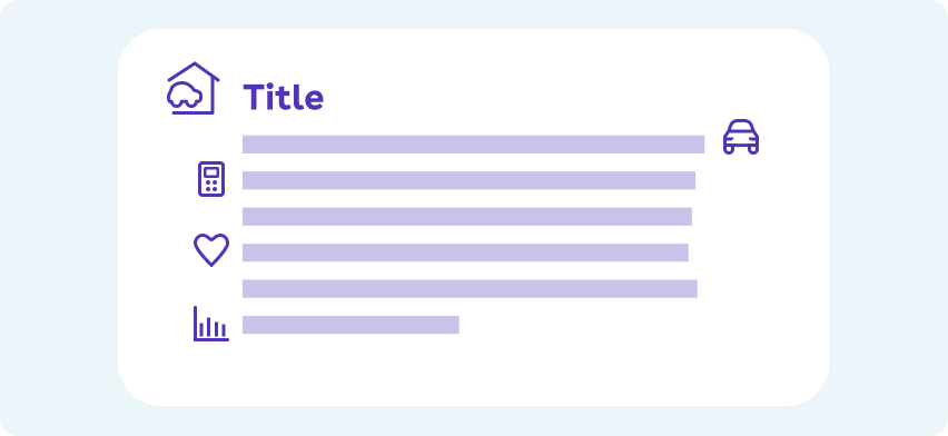
Iconography can be used to support key information or key actions on the page
Standard grid / Icon usage
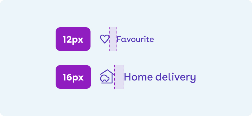
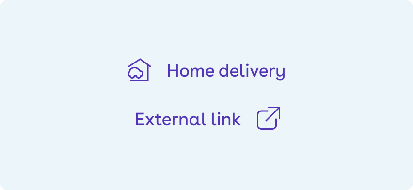
Icons can either sit before or after text depending on what the icon is conveying.
Do
- Use the default icon sizes at the dimensions they are drawn at.

Don't
- Scale icons outside of their dimensions unless there is very good reason to - such as being part of a hero graphic.
Do
- Use the correctly sized icon to balance against any typography i.e small icon against small text, larger icon against larger text.
Do
- Give space to icons and let them breath.
Don't
- Overuse icons on a page. Not every line needs an icon.
Do
- Place the icon to the left or right of text depending on the context.

Don't
- Change the colour of icons from Mid Purple unless the icon is on a coloured background - in that case colour the icon White.